Way More than Wayfinding
By Michael Mozdy
Without a doubt, the Natural History Museum of Utah is beautiful. I'm not the only one who thinks so. Our first few years in our new location saw a slew of awards: Excellence in Architecture for a New Building, Global Design Merit Award, Buildy Award for Most Outstanding Large Museum Construction, Excellence in Exhibition and Muse Award, etc.
But there are challenges to creating engaging moments around every bend and in every cranny. One spot on the second floor, in particular, needed some re-evaluation.
When you enter the museum on this level, your view is dominated by the three-story, glass-enclosed Collections Wall that vibrantly displays objects from our many collections. This wall separates our research and archived collections area from our public exhibition areas.
As if this wasn't enough, you're in what we call The Canyon, architecturally echoing a Utah slot canyon with footbridges crossing it on Levels 3, 4, and 5. In short, there's a lot going on visually, especially if you look up. But across from the Collections Wall on Level 2 is a location where you can turn a corner and begin exploring the Past Worlds dinosaur exhibits.
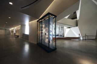
"It's a tough location," admits our Senior Exhibit Designer, Timothy Lee. He and the exhibits team studied how visitors were using the space and the case that was placed in this location. They decided the case wasn't being used in the way they had hoped, and a re-design was in order.
"Because it was in a circulation corridor, it made sense to use it for wayfinding," Lee explains, "and because it was next to the topographic map in the middle of The Canyon, we thought it could highlight what makes Utah remarkable."
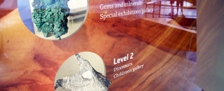
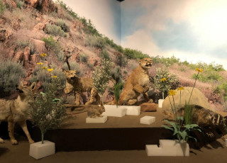
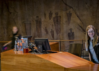
Tim and the design team decided to create a dual-sided case with objects from our collections bridging and connecting the two sides. On the side facing the Collections Wall, a brilliant red rock sandstone image provides the backdrop for these objects - highlighting the diversity of objects found in Utah's amazing landscape. Each of the objects corresponds with similar ones from different levels and galleries, and this side acts as a wayfinding case to help visitors navigate the museum:
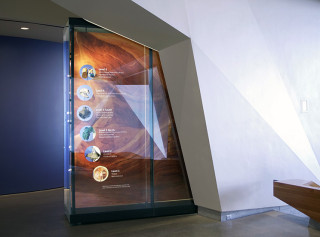
The other side of the case tells a different story about place and the objects' relationship to our geography over time. This side is inspired by infographics and graphic design:
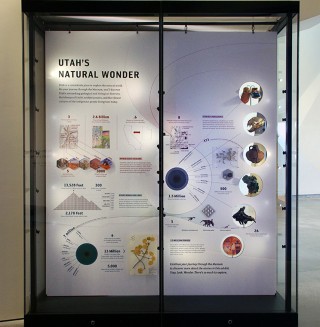
I find it visually arresting to see the three-dimensional objects embedded in the two-dimensional space, and realize how they fit with both sides of the display, but in different ways. Lee tells me that this is precisely the point: every object in the museum has the potential to tell many stories.
"It gives our visitors a message: expect to look at these objects in unexpected ways," says Lee.
This case, while arguably in one of the more visible locations of the museum, is easy to overlook because of the stunning features around and above it. I encourage you to explore it the next time you're in the museum, however. It is another great example of how everything at NHMU is designed carefully with an educational purpose in mind and the visitor experience at the forefront.
Michael Mozdy is a Digital Science Writer for The Natural History Museum of Utah, a part of the University of Utah in Salt Lake City. Our mission is to illuminate the natural world and the place of humans within it. In addition to housing outstanding exhibits for the public, NHMU is a research museum. Learn more.
